Remember: to see a larger version of each screen shot click on the thumbnail.
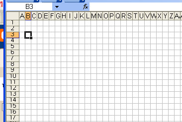
I'm using Microsoft Excel 2003 on a PC, so the location of some of the menus and tools may vary depending on your version. The general technique should work just fine for you. These instructions will give you a square grid. Keep in mind that knit stitches are not perfect squares.)
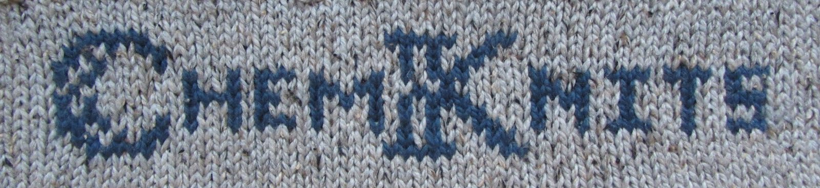
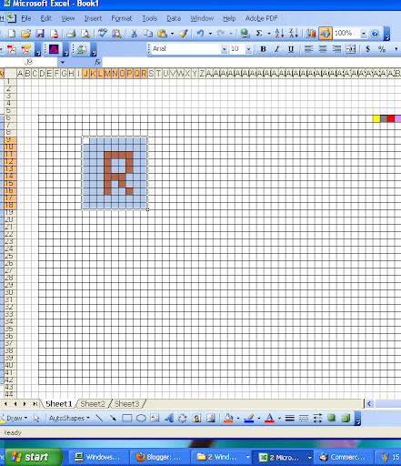
The knitting chart you created in Part 1.
The Formatting Toolbar

The formatting toolbar may already be part of the toolbar you can see already. The buttons that will be most useful for your chart design are found on the default right hand side of the toolbar.
- Familiarize yourself with the Formatting Toolbar. If this is not visible immediately, you can open it by going to Viwe --> Toolbars --> Formatting. (See the check by the formatting bar.)
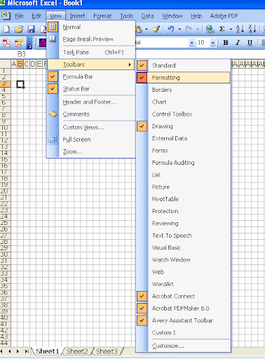
How to find the Formatting Toolbar
- There are two parts of the toolbar that you need to draw your chart. "Fill Color" and "Borders".
- If you plan on making a lace chart (not covered in this How To Article) you will need to find what symbols correspond to K2tog etc instead of Colors.
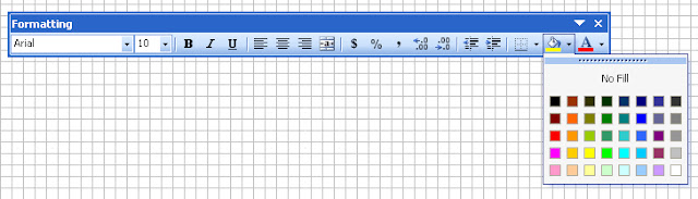
Fill Color will be your color pallet for your chart
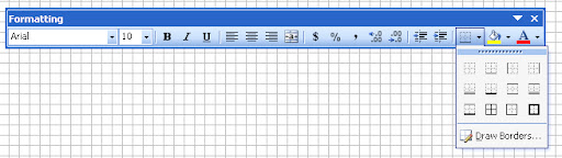
Borders will help you provide a grid that is visible when you print your chart. Although you can currently see a grid, if you try looking at your work with "Print Preview" this grid is invisible.
Drawing your Chart
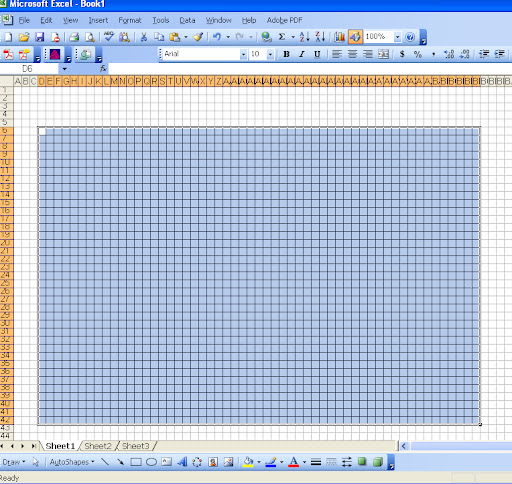
- Choosing your color Pallet. By reading the above formatting toolbar section, you should know how to find the Borders Toolbar. We will start my making a grid the that should be large enough to accommodate our project. Select (highlight) the region you would like to make a grid with.
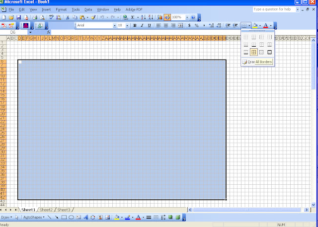
- In the Borders Tool Menu, select "All Borders" (The symbol looks like a mini grid.)
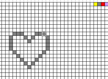
- Now it's time to choose your color pallet using the "Fill Color" Button off of the toolbar. When drawing your chart, you could highlight each grid field you would like to change color, then go to fill color and select the color you want. This would quickly become tedious. I prefer to make a mini color pallet in the corner of my workspace, and use Copy and Paste to make my chart.
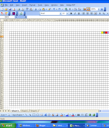 See the mini color pallet in the top right section of the grid with 4 colors. Now you can copy and paste from these colors, rather than go into the Fill Color menu each time you want to make a color selection.
 - Draw your chart! Copy the color you want in you "palette", select a cell, and paste to change the color. Continue until you have drawn the outline or design of your choice.
- Even if you have copied one lavender square, if you highlight 4 empty cells before you paste, all of them will turn lavender. (This can make filling in the a shape much easier.)
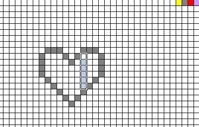
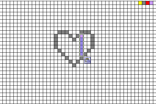
Select multiple cells (left) and paste the color into all of them (right)
Save your work often!
Even with saving your file frequently (I will save each time I pause, but I am neurotic about saving), it is possible to erase your hard work accidentally. Or it can be hard to undo some modifications you made to your chart, and you would like to go back to a previous version. I like to save my in progress charts by copying them to a lower area of the same excel document.
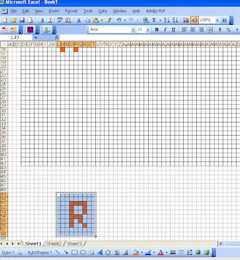
If you copy the chart (in rows 11-16) and paste it below the work-in-progress grid (I pasted at rows 49-58), then you have a copy you can work on, but a previous version saved below. This way, if you become unhappy with your progress and would like to go back to an earlier version, you can!
Continue to Part 3 (How to share your chart)
Go Back to Part 1 (Setting up your chart)
